SQL Compare 12: Initial Look
I know there have been a few other folks going into more detail on SQL Compare 12 (beta), but I thought I’d share just a few looks at the new design. Looks pretty slick, and I like where the design is going. Just a quick look, as I’m sure there will be more to cover when it’s finally released. Until then….
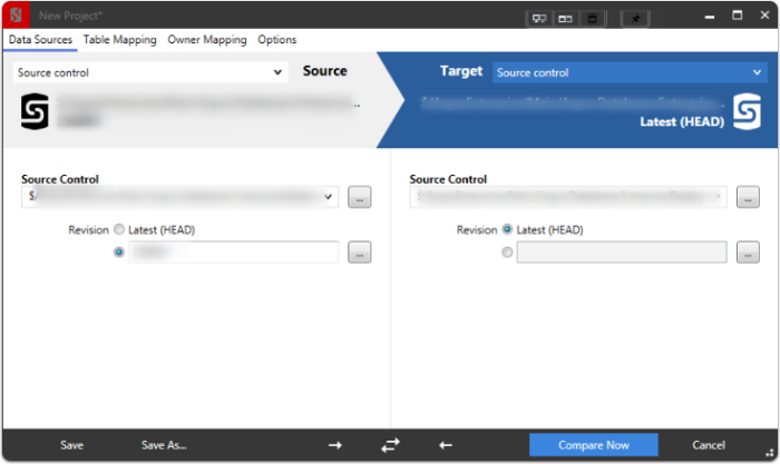
Some GUI Improvements
Very clean. Not too drastic of a change to mess with current workflows. Still, nice to see some clean design like this.
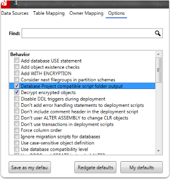
Options dialogue
Same options, just slightly different navigation/ui design to get there.
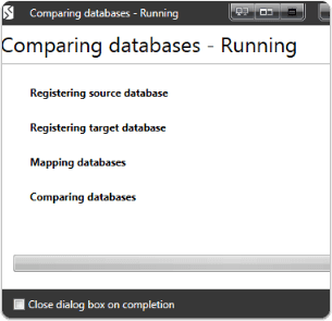
Comparing databases
Comparing running… saving me a massive amount of work in not creating scripts by hand :-)
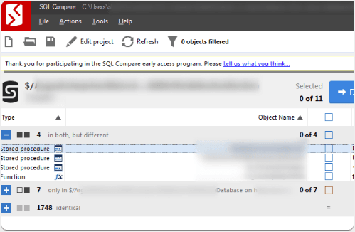
Comparison matches
Final thoughts
Again, this was just a quick peek at what I’ve looked at. Overall, I like the design choices. UI Design improvements are nice. I would say the next stage would be seeing this better design roll-out into better report styling & formats, making it consistent. Additionally, while the UI improvements are nice, the code diff viewer at the bottom looks pretty similar, and I’d love the ability to have this improved a little. Perhaps even the option to use “external diff viewer” and pipe it into my preferred diff viewer (Araxis Merge for me). Officially, I’m part of the Friend’s of Red Gate community now, so I’ll probably be posting a bit more on their tools as I’ve got the chance to work with more of them now. I’ve always been a big fan of their products, and now I get a chance to be part of their community and help with testing, feedback, and advocating their great stuff when it would help folks out. Final thought… why can’t all great tools have a full Solarized Dark theme? ;-)
Webmentions
(No webmentions yet.)