Programming Fonts For The Newb
the camps
Once you get into coding fonts, you’ll find that there are two primary camps.
- Don’t give a crap about it. “I’ll use defaults for everything and probably wouldn’t care if I was coding in Arial”. If this is you, then this post is definitely not for you. Please continue to enjoy Comic Sans with my pity. :-)
- Font aficionados “Your world will change forever once you use this specific font! It will increase your productivity 300%”
Inside the font afficiando realm, you have various subcultures.
- Fixed Font Only
- Elastic Tabstops are the future, why can’t anyone get with the program? (Elastic tabtop fonts allow proportional fonts with better alignment )
- Ligature Fonts changed my world
cool resource
One really cool resource for exploring these various types of fonts is Programming Fonts - Test Drive. This is a pretty cool resource to preview various fonts and find links and resources for them.
monospaced
Monospaced fonts ensure that every character take up the same amount of space regardless. This means a period takes up the same space as any other letter of the alphabet.
The goal in recommending this for code editing has to do with the purpose of what’s being written and read. In reading your eyes flow over words, and punctuation, while important, supports the words. It doesn’t need to take up the same space. In code, every punctuation character is just as important as every single letter written. If you have a bunch of nested formulas for example, reading
|
|
becomes harder than ensuring all the punctuation and special characters are easily readable like this:
|
|
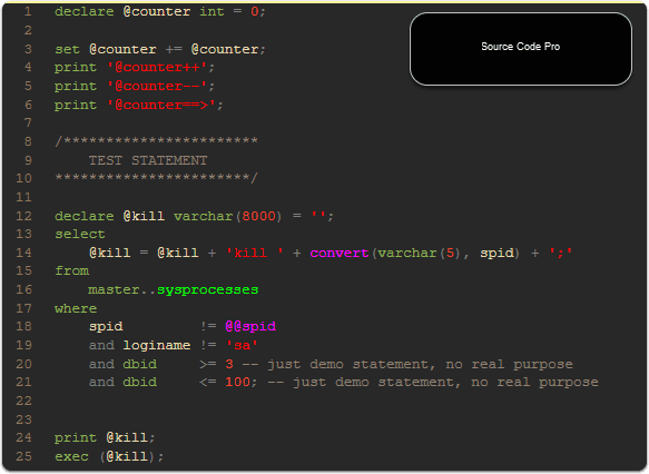
Visual Studio, SSMS, and other editors by default choose a monospaced font in code editing. However, there are additional options besides the built in fonts.
some i’ve explored
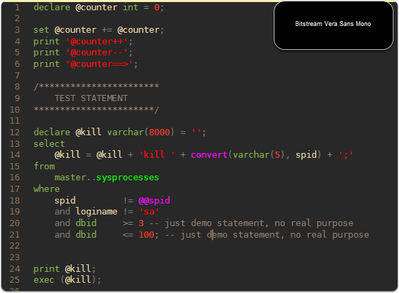
- Bitstream Vera Sans Mono: My go to for a long time. It’s aesthetically nice, and has a bit of the Ubuntu styling with some rounder edges.
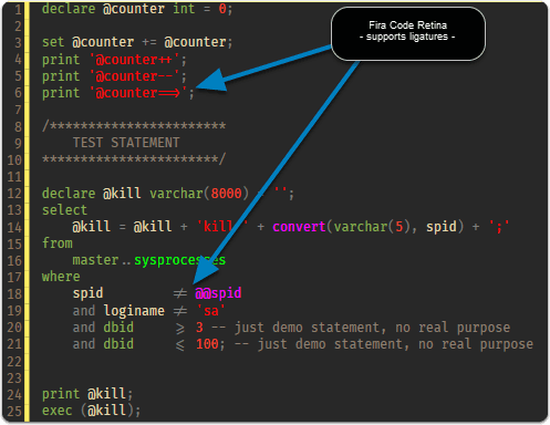
- Fira Code Retina: Very nice with ligature support. This has become my current favorite due to the very nice style with the added perk of the ligatures. That’s a nice little typography enhancement that really makes special combinations of characters stand out for readability. This is just a rendering feature that doesn’t impact the underlying text per documentation:
This is just a font rendering feature: underlying code remains ASCII-compatible. This helps to read and understand code faster. FiraCode Github
what to what to look for
As you dive into the world of exploring fonts, here’s a couple things I’d look for.
- Characters that can hide problems are easily identified such as a period, or dash, most monospaced fonts are great for this, but some have smaller symbols that might make them a little less readable.
- Resizes well for your target zoom. I’ve tried some fonts that don’t seem to look right once you change your zoom level or the size of the font. I looked up some details on this and apparently some fonts are bitmapped, and some vector images. If you are using bitmapped fonts, then the target size is ideal, while adjusting zoom level can cause blurriness or fuzzy quality as it’s not going to rescale like a vector based font would. This isn’t bad if you are ok with the normal font size levels.
So far my personal favorite is Fira Code, so check that one out if you are looking for something interesting to try.
Webmentions
(No webmentions yet.)